-

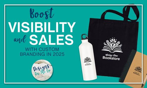
Boost Visibility and Sales with Custom Branding in 2025
Custom branding is the key to standing out in 2025. Discover how tailored solutions can boost your small business visibility, build trust, and drive sales. From enhancing your online presence to making a statement at events, this guide covers it all. Let’s make your brand unforgettable!
-

The Importance of a Strong Brand Identity: How to Stand Out and Thrive as a Small Business
Explore the importance of a strong brand identity for small businesses. Discover why professionally designed branding, including packages with printed materials, can boost your business.
-

What Should the Branding Experience Be Like?
Discover what a great branding experience looks like. Learn how collaboration, multiple proofs, and open feedback lead to branding success. Let Designs On The Go help you create a brand you love.
-

What is Branding?
Learn the definition of branding and how it shapes customer perception. Discover key branding elements like logos, color palettes, and tone of voice to build trust and recognition for your business.
-

How to Create a Memorable Logo: Tips for Designing a Brand that Lasts
Learn how to create a memorable logo that represents your brand with these essential tips. Designs On The Go offers professional logo design services to make the process easy.
-

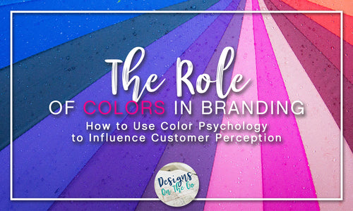
The Role of Colors in Branding: How to Use Color Psychology to Influence Customer Perception
Learn how the psychology of colors can influence customer perception and how to choose the right colors for your small business brand.
-

Leveraging Customer Feedback for Brand Improvement
Discover how leveraging customer feedback can enhance your small business brand. Learn how to include your audience in the process for a stronger connection and greater brand success.
-

The Role of Typography in Branding: How to Choose the Right Fonts for Your Brand
Discover the importance of typography in branding and how choosing the right fonts can enhance your brand's image. Learn how to select fonts that communicate your brand's personality effectively.
-

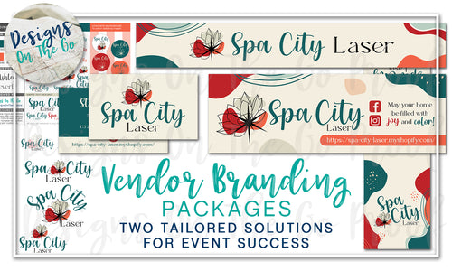
Vendor Branding Packages: Two Tailored Solutions for Event Success
Discover two comprehensive Vendor Branding Packages from Designs On The Go. Whether you're just starting or want to elevate your booth presence, our bundles provide everything from logo design to banners and business cards—all at a discounted price!
-

Branding on a Budget: Affordable Strategies for Small Businesses
Discover cost-effective branding strategies for small businesses. Learn how to build a memorable brand without breaking the bank, with affordable solutions from Designs On The Go.
-

Consistency is Key: The Backbone of a Strong Brand Identity
Building a strong brand identity starts with consistency. Learn why maintaining a cohesive brand across all platforms is crucial for your small business’s success.
-

The Benefits of Professional Branding Services: Elevating Your Small Business Image
Discover the benefits of hiring professional branding services for your small business. Learn how Designs On The Go can enhance your brand's image and set you up for long-term success.
-

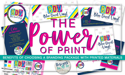
The Power of Print: Benefits of Choosing a Branding Package with Printed Materials
Discover the benefits of choosing a branding package with printed materials from Designs On The Go. Enhance your brand’s visibility and impact with professionally designed physical marketing tools.
-

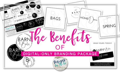
The Benefits of a Digital-Only Branding Package
Discover the benefits of a digital-only branding package, including cost-effectiveness, versatility, and eco-friendliness, with Designs On The Go. Perfect for small businesses looking to enhance their online presence.
-

Brand Storytelling: How to Connect with Your Audience
Discover how brand storytelling can help small businesses build a loyal customer base by connecting with their audience on a deeper level.
-

Branding for All Kinds of Businesses: Tailored Tips for Retail, Services, and E-Commerce
Discover branding tips tailored for different business types—retail, service-based, and e-commerce. Learn how to craft a brand that resonates with your audience and sets you apart from the competition.
-

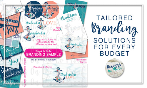
Tailored Branding Solutions for Every Budget
Explore budget-friendly branding options with Designs On The Go. From logo-only packages to comprehensive branding and vendor setups, we offer customizable solutions to fit any budget.
-

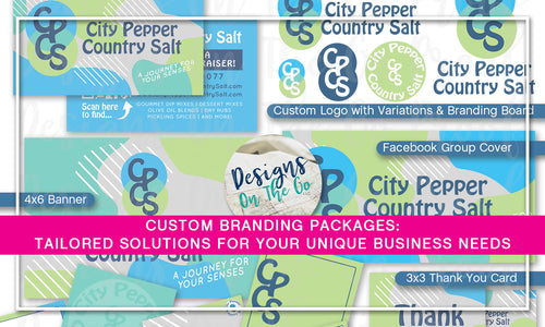
Custom Branding Packages: Tailored Solutions for Your Unique Business Needs
Not finding the right fit in our branding packages? At Designs On The Go, we offer custom branding solutions tailored to your unique business needs. Let’s create a package that reflects your vision and goals!
-

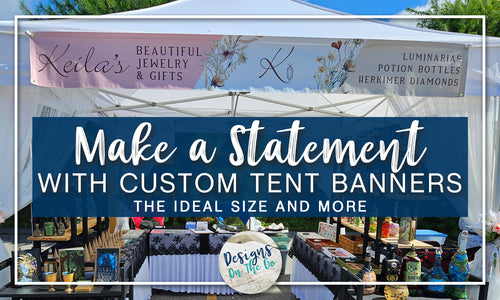
Make a Statement with Custom Tent Banners: The Ideal Size and More
Make a statement at your next event with a custom tent banner. Learn why a slightly smaller size, like 1' x 8', is ideal for the best fit and visibility.
-

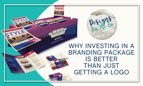
Why Investing in a Branding Package is Better Than Just Getting a Logo
Discover the benefits of investing in a comprehensive branding package over just a logo. Learn how a cohesive brand identity can elevate your business and tips for affording more on a budget.
-

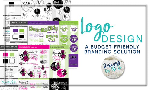
Logo Only: A Budget-Friendly Branding Solution
Discover the Logo Only option from Designs On The Go, a budget-friendly solution for small business branding. Get a professional logo, variations, and a branding board for a fraction of the cost. Files come in PNG format, with PDFs upon request and vector formats available for an additional fee.
-

The Impact of Branding on Customer Loyalty
Discover how effective branding can foster customer loyalty and drive repeat business. Learn the key elements that create a memorable experience, build trust, and forge emotional connections with your audience.
-

Rebranding: When and How to Refresh Your Brand
Rebranding can rejuvenate your business and align it with new goals, but it's not a decision to be taken lightly. Discover the signs that indicate it's time to rebrand and learn the steps involved in the rebranding process to ensure a successful transformation.
-

Why Your Logo Needs to Be High Resolution
Discover why a high-resolution logo is crucial for your brand's success. Learn about different logo file formats like PNG, PDF, AI, EPS, and JPEG, and how Designs On The Go can help you with high-quality branding solutions.
-

Affordable Branding Solutions for Small Businesses: Get Started with Designs On The Go
Discover affordable branding solutions for your small business with Designs On The Go. From flexible payment plans to building as you go, learn how to build a powerful brand without breaking the bank. Contact us today to discuss your needs and vision—it’s free to chat!
-

Having a Logo Can Make or Break Your Small Business
A professional logo can make or break your small business. Discover why having a well-designed logo is crucial for brand recognition, building trust, and creating a lasting impression. Learn how Designs On The Go can help you craft a logo that elevates your brand.
-

Unleash Your Small Business Brand: A Transformative Guide
Defining your small business brand is crucial for connecting with your audience and standing out in the market. Learn how to discover your unique brand identity through mission, vision, audience analysis, and more. Need help? Designs On The Go offers expert branding solutions to elevate your business.
-

Why Your Small Business Needs a Killer Logo: The Ultimate Guide to Branding Success
A professional logo is more than just a symbol; it's the face of your business. Discover the top benefits of having a killer logo for your small business and learn how it can boost brand recognition, build trust, and support your marketing efforts. Ready to elevate your brand? Read on to find out more!
-

Mastering Brand Consistency: Using Your Brand Style Guide and High-Resolution Logos
In today’s competitive landscape, mastering your brand’s visual identity is key to standing out. Discover how to effectively utilize your brand style guide alongside high-resolution logos to ensure consistency across all platforms and strengthen your brand presence. Dive into our comprehensive guide and elevate your brand’s image with confidence and clarity.
-

Embrace Depth: The Power of Branding with Deep Hues
Unlock the potential of deep hues in your branding strategy. Discover how rich, vibrant colors can evoke emotions, establish a strong identity, and make your brand unforgettable. Learn from Designs On The Go how to use deep hues to elevate your business and stand out in a competitive market. Embrace the power of color today!
-

Name to Fame: Let Your Logo Echo Your Business Identity!
Discover the power of branding with Designs On The Go! Our blog, "Name to Fame: Let Your Logo Echo Your Business Identity," explores the impact of logo design on small business success. Learn how effective branding can make your business memorable and boost your market presence. Get started today!
-

The ABCs of Building a Brand: Branding Solutions for Every Business!
Discover the ABCs of Building a Brand with Designs On The Go! Our expert branding solutions include logo design, brand identity, and more. Elevate your business with professional, memorable branding that sets you apart from the competition. Learn how we can help you stand out and succeed!
-

Logo to Liftoff: Elevate Your Brand Across Every Medium!
Discover how Designs On The Go can elevate your brand from logo design to liftoff! Explore essential tips for small business branding, optimizing your Shopify store, and enhancing SEO. Learn how to make your logo shine across every medium and boost your business success.
-

Beyond Design: Crafting Logos with Purpose and Meaning
At Designs On The Go, we believe in crafting logos with purpose and meaning. Our expert branding and logo design services focus on creating symbols that truly represent your small business. Discover how thoughtful design can elevate your brand beyond aesthetics, adding depth and significance to your identity.
-

Embracing Rustic Charm: Elevate Your Brand with a Touch of Country Elegance
Elevate your small business with rustic charm! At Designs On The Go, we specialize in blending country elegance into your branding and logo design. Discover how adding a touch of rustic style can set your brand apart and create a unique, memorable identity. Embrace the charm and boost your business today!
-

The Logo Dilemma: Why Hiring a Professional is Worth Every Penny
Discover why hiring a professional for logo design is essential for your small business. At Designs On The Go, we understand that a strong logo is crucial for effective branding. Our expertise ensures your logo stands out, representing your brand perfectly. Invest in quality branding and see the difference it makes!
-

Radiate Success: The Power of Cultivating a Vibrant Brand Identity
-

Color Your World: Make Your Brand Pop with Fun and Bright Hues!
In the vibrant landscape of modern branding, standing out is essential. In a sea of competitors, your brand needs to captivate attention and leave a lasting impression. One powerful way to achieve this is by infusing your brand with fun and bright hues that radiate energy and positivity. Let's explore how embracing bold colors can elevate your brand and make it truly unforgettable.
-

Branding Adds Value: How to Position Your Business for Premium Appeal


