Color plays a vital role in branding. It’s not just about aesthetics—it’s about communication. Colors can evoke emotions, shape perceptions, and influence behaviors. As a small business owner, understanding the psychology of colors can help you create a brand that resonates with your target audience and leaves a lasting impression. Let’s explore the role of colors in branding and how you can use them effectively to elevate your business.
The Psychology of Colors in Branding
Colors can trigger psychological responses in customers, either consciously or subconsciously. Different colors can evoke specific emotions, moods, and associations. Understanding the meaning behind these colors is essential to ensure your brand conveys the right message.
- Red: Passion, Energy, and Urgency
Red is a powerful color that evokes feelings of passion, energy, and excitement. It’s also known to create a sense of urgency, which is why it’s often used in clearance sales and call-to-action buttons. However, use red sparingly as too much of it can feel overwhelming or aggressive.
- Best for: Brands that want to convey boldness, excitement, or urgency.
- Examples: Coca-Cola, Target, Netflix.
- Blue: Trust, Calm, and Reliability
Blue is associated with trust, professionalism, and calmness. It’s a favorite among brands in industries like finance, healthcare, and technology because it creates a sense of security and dependability. It’s also a calming color that encourages a peaceful atmosphere.
- Best for: Brands that want to communicate trust, reliability, and tranquility.
- Examples: Facebook, IBM, American Express.
- Yellow: Happiness, Optimism, and Warmth
Yellow is the color of sunshine and optimism. It’s an attention-grabbing color that evokes feelings of happiness, positivity, and warmth. However, yellow can also represent caution if used in the wrong context, so it’s important to use it in moderation.
- Best for: Brands that want to convey cheerfulness, fun, or affordability.
- Examples: McDonald’s, IKEA, Best Buy.
- Green: Growth, Health, and Nature
Green is commonly associated with nature, health, and growth. It’s a soothing color that represents balance and harmony, making it ideal for brands in the wellness, organic food, or eco-friendly space. Darker greens can also symbolize wealth and stability.
- Best for: Brands focused on health, wellness, sustainability, and wealth.
- Examples: Starbucks, Whole Foods, Land Rover.
- Orange: Creativity, Enthusiasm, and Friendliness
Orange is a vibrant and energetic color that represents creativity, enthusiasm, and friendliness. It’s bold without being as intense as red, and it can create a welcoming and fun vibe. Orange is often used to grab attention in a friendly, approachable way.
- Best for: Brands that want to be seen as creative, fun, and approachable.
- Examples: Fanta, Nickelodeon, Amazon.
- Purple: Luxury, Royalty, and Wisdom
Purple is often associated with royalty, luxury, and wisdom. It’s a color that communicates sophistication and exclusivity, making it popular in industries related to beauty, fashion, and luxury goods. Lighter shades like lavender can also evoke calmness and relaxation.
- Best for: Brands focused on luxury, elegance, or creativity.
- Examples: Cadbury, Hallmark, Yahoo.
- Black: Sophistication, Elegance, and Authority
Black is a classic, timeless color that represents sophistication, elegance, and authority. It’s often used by high-end brands to convey exclusivity and luxury. While black can be very striking, too much of it can come across as cold or unapproachable.
- Best for: Brands in the fashion, luxury, or tech industries.
- Examples: Chanel, Nike, Apple.
- White: Simplicity, Purity, and Cleanliness
White is often associated with simplicity, purity, and cleanliness. It’s frequently used in minimalistic designs to create a clean and modern look. White can also help emphasize other colors, making it a great choice for brands that want to keep things simple and uncluttered.
- Best for: Brands that want to communicate simplicity, cleanliness, or modernity.
- Examples: Apple, Tesla, Nike.
Choosing the Right Colors for Your Brand
Now that you understand how different colors can influence customer perception, it’s time to choose the right colors for your brand. Here are some tips to help you make the best choice:
- Know Your Audience: Consider your target audience’s demographics, preferences, and cultural associations with colors. For example, red might symbolize luck in some cultures but danger in others.
- Align with Your Brand Personality: Make sure the colors you choose align with your brand’s core values and personality. If you’re running a wellness brand, green would be a natural choice. For a high-end luxury brand, purple or black may be more appropriate.
- Create Contrast: Make sure your brand colors stand out by creating contrast between your primary and secondary colors. This will make your branding more visually appealing and easier to read, especially on digital platforms.
- Stick to a Consistent Color Palette: Consistency is key in branding. Once you’ve chosen your color palette, use it across all your branding materials—from your logo to your website and social media platforms.
- Test and Get Feedback: Don’t be afraid to test different color options and get feedback from your customers. This can help you make more informed decisions about what resonates with your audience.
How Designs On The Go Can Help with Branding Colors
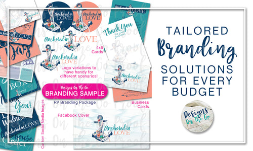
At Designs On The Go, we specialize in helping small businesses create strong, cohesive branding that includes the perfect color palette. Whether you need help choosing the right colors for your logo, website, or marketing materials, we’re here to guide you through the process. Our branding packages include professional design services that ensure your brand stands out and makes a lasting impact.

